This is not about the New Normal that is often mentioned when we discuss the future in the wake of the Covid-pandemic.
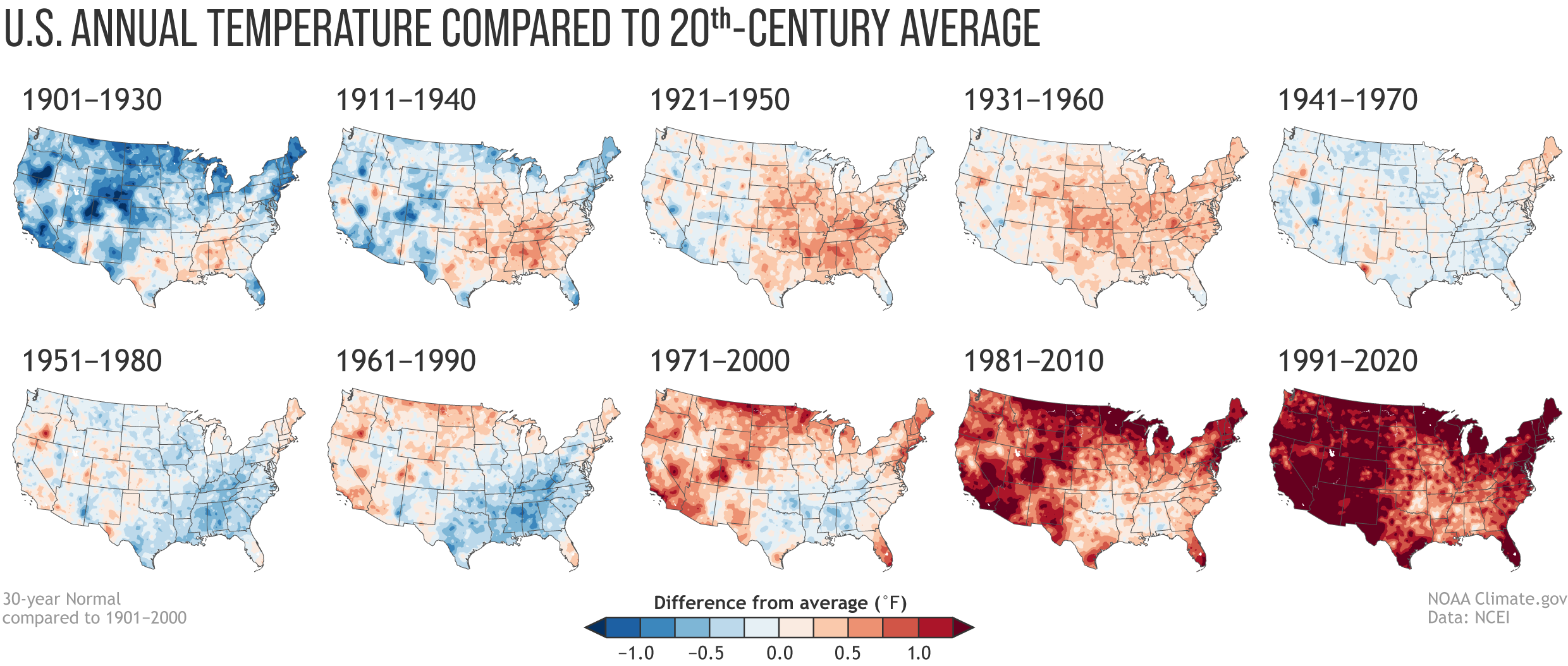
This is about the visualization of the shifts in average temperature for the US. This highlights pretty impressively how the temperature has changed over the last since 1901.
Every 10 years, NOAA – the National Oceanic and Atmospheric Administration – redefines “normal” weather (in terms of rainfall, temperature, and other characteristics of the climate). The base for each re-definition is the preceding 30-year window.
Now let’s have a look at the temperature to get an impression of global warming.
Rebecca Lindsay’s contribution has answers to some of the most immediate questions:
Is global warming affecting the Normals? (Yes). Are the Normals adjusted to “subtract out” global warming? (No.) So the new normal reflects our changing climate? (Yes). Then how do we keep track of what used to be normal? (Different analyses.)
The influence of long-term global warming is obvious: the earliest map in the series has the most widespread and darkest blues, and the most recent map has the most widespread and darkest reds. Today, the normal annual temperatures across the country are warmer than the 20th-century average virtually everywhere. From 1901-1930, the annual average temperature was mostly colder than the 20th-century average.
For me, this is a brilliant presentation of data. This visualization really helps us to understand that something dramatic is going on.
By the way. The visualization is so impressive because it uses small multiples introduced by Edward Tufte in his Visual Display of Quantitative Information. In this case, the small multiples assist us in tracking temperature development across time and space.