I have to admit that I am not completely color blind, but I have some issues with red and green. I only recognize a 17 in the image below. Others – I am told – also see a 42.
Maybe this is why I opted for a clear black and white contrast in the re-launch of my website. After seeing the image below, I am even happier that I choose an easy and not ambiguous color scheme.
Colors can be deceptive. Look at this and decide whether you see balls of different colors.
If you believe that the balls are of different colors – shades of blue, red, and green – then you are not color blind, but the whole optical illusion worked.
Frankly, I could not believe it. I really had to test it with the pipette tool in Powerpoint (not any fancy graphical applications). Here are the colors of the top row of the balls (the ones that are cut off a bit):
Taking up yesterday’s post and the notion of small multiples introduced by Edward Tufte in his Visual Display of Quantitative Information, I’d like to highlight another excellent interactive visualization of climate change. This time the melting of glaciers.
The Guardian’s Niko Kommenda has an excellent piece on this.
The illustration highlights how the outlines of the 90 largest and most surveyed glaciers shrink over the course of a couple of generations.
This is not about the New Normal that is often mentioned when we discuss the future in the wake of the Covid-pandemic.
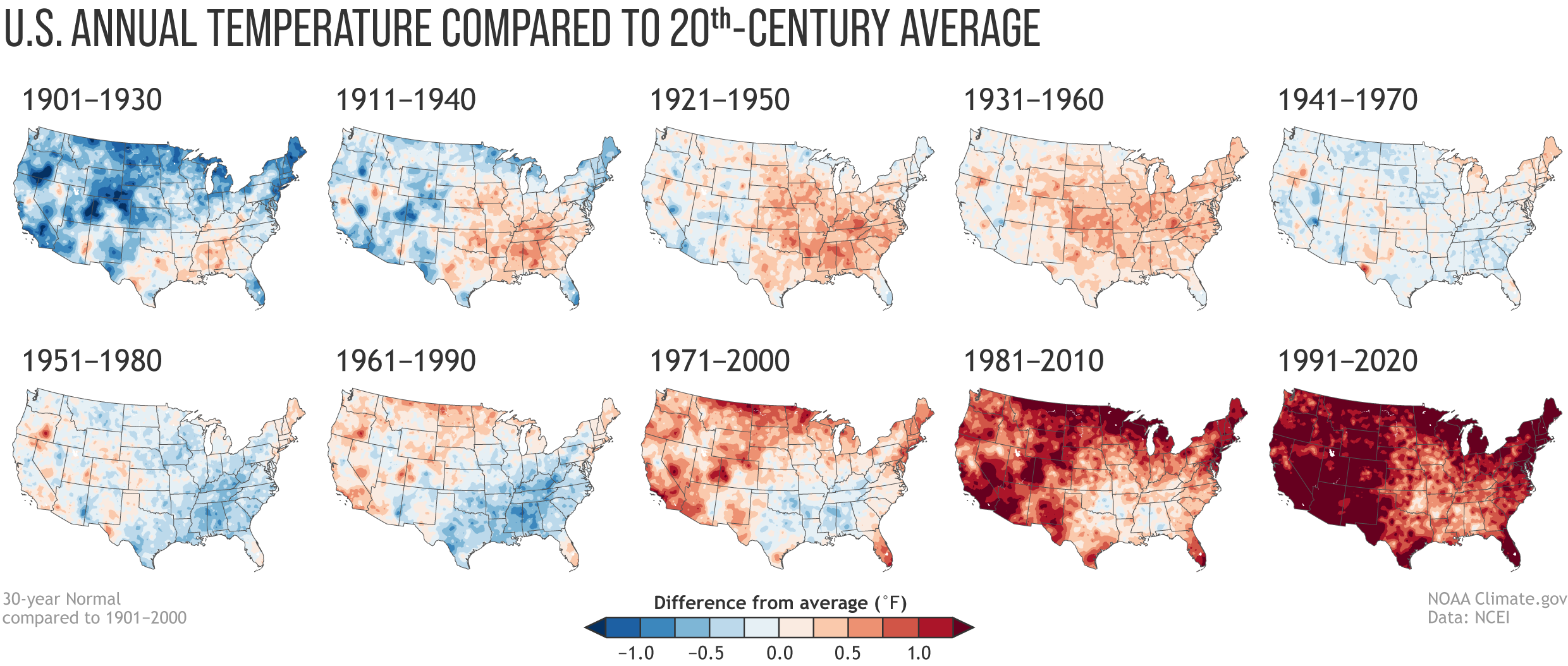
This is about the visualization of the shifts in average temperature for the US. This highlights pretty impressively how the temperature has changed over the last since 1901.
Every 10 years, NOAA – the National Oceanic and Atmospheric Administration – redefines “normal” weather (in terms of rainfall, temperature, and other characteristics of the climate). The base for each re-definition is the preceding 30-year window.
Now let’s have a look at the temperature to get an impression of global warming.
Annual U.S. temperature compared to the 20th-century average for each U.S. Climate Normals period from 1901-1930 (upper left) to 1991-2020 (lower right). Places where the normal annual temperature was 1.25 degrees or more colder than the 20th-century average are darkest blue; places where normal annual temperature was 1.25 degrees or more warmer than the 20th-century average are darkest red. Maps by NOAA Climate.gov, based on analysis by Jared Rennie, North Carolina Institute for Climate Studies/NCEI. Image is from https://climate.gov/news-features/understanding-climate/climate-change-and-1991-2020-us-climate-normals
Rebecca Lindsay’s contribution has answers to some of the most immediate questions:
Is global warming affecting the Normals? (Yes). Are the Normals adjusted to “subtract out” global warming? (No.) So the new normal reflects our changing climate? (Yes). Then how do we keep track of what used to be normal? (Different analyses.)
The influence of long-term global warming is obvious: the earliest map in the series has the most widespread and darkest blues, and the most recent map has the most widespread and darkest reds. Today, the normal annual temperatures across the country are warmer than the 20th-century average virtually everywhere. From 1901-1930, the annual average temperature was mostly colder than the 20th-century average.
For me, this is a brilliant presentation of data. This visualization really helps us to understand that something dramatic is going on.
By the way. The visualization is so impressive because it uses small multiples introduced by Edward Tufte in his Visual Display of Quantitative Information. In this case, the small multiples assist us in tracking temperature development across time and space.
We use cookies on our website to give you the most relevant experience by remembering your preferences and repeat visits. By clicking “Accept”, you consent to the use of ALL the cookies.
This website uses cookies to improve your experience while you navigate through the website. Out of these, the cookies that are categorized as necessary are stored on your browser as they are essential for the working of basic functionalities of the website. We also use third-party cookies that help us analyze and understand how you use this website. These cookies will be stored in your browser only with your consent. You also have the option to opt-out of these cookies. But opting out of some of these cookies may affect your browsing experience.
Necessary cookies are absolutely essential for the website to function properly. These cookies ensure basic functionalities and security features of the website, anonymously.
Cookie
Duration
Description
cookielawinfo-checbox-analytics
11 months
This cookie is set by GDPR Cookie Consent plugin. The cookie is used to store the user consent for the cookies in the category "Analytics".
cookielawinfo-checbox-functional
11 months
The cookie is set by GDPR cookie consent to record the user consent for the cookies in the category "Functional".
cookielawinfo-checbox-others
11 months
This cookie is set by GDPR Cookie Consent plugin. The cookie is used to store the user consent for the cookies in the category "Other.
cookielawinfo-checkbox-necessary
11 months
This cookie is set by GDPR Cookie Consent plugin. The cookies is used to store the user consent for the cookies in the category "Necessary".
cookielawinfo-checkbox-performance
11 months
This cookie is set by GDPR Cookie Consent plugin. The cookie is used to store the user consent for the cookies in the category "Performance".
viewed_cookie_policy
11 months
The cookie is set by the GDPR Cookie Consent plugin and is used to store whether or not user has consented to the use of cookies. It does not store any personal data.
Functional cookies help to perform certain functionalities like sharing the content of the website on social media platforms, collect feedbacks, and other third-party features.
Performance cookies are used to understand and analyze the key performance indexes of the website which helps in delivering a better user experience for the visitors.
Analytical cookies are used to understand how visitors interact with the website. These cookies help provide information on metrics the number of visitors, bounce rate, traffic source, etc.
Advertisement cookies are used to provide visitors with relevant ads and marketing campaigns. These cookies track visitors across websites and collect information to provide customized ads.