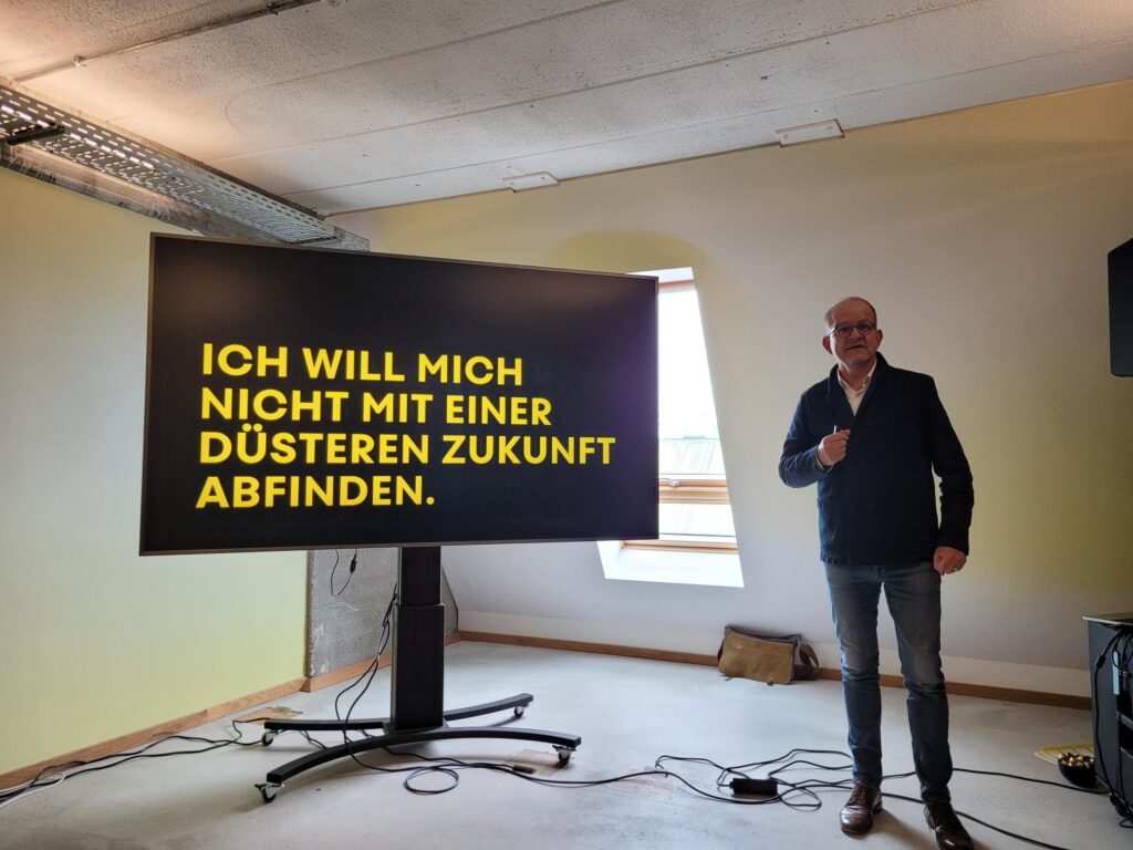
Categories
Sustainability Uncategorized

I am Beautiful

No, no, no. This will not be a post where I can live my narcissistic side. This is about an ad campaign by German McDonald’s.

They show a used paper coffee cup and claim in bold letters: I (the paper cup) am beautiful because I might become a book someday (see here).

I was stunned to see a one-way packaging item be the center stage of a campaign. I could imagine that one-way packaging is part of a campaign advising against its use. But here, right to the contrary: this campaign clearly associates one-way packaging with positive attributes.

Why on earth would you want to do this? – Frankly, I have no idea.

If I look at this, a lot crosses my mind. The first thing is that McDonald’s is greenwashing here big time. The second thing is that McDonald’s is the largest fast-food chain in Germany. Judged by the number of restaurants McDonald’s (1,484) is larger than the next two chains (Burger King, 750; Subways, 692). So, being Mcdonald’s is something (or not nothing). What could you have done with the size and the resources that come with it, other, I mean, than hiring Scholz and Friends for this campaign?

You could have thought about establishing a system of reusable cups and packaging. I imagine that you (as McDonald’s) could have built a business from the reusable cups by (kind of) forcing this reusable packaging system on other providers of system gastronomy.

I could only speculate why we see greenwashing instead of doing something that changes the system. It would be nice to see research on the power structure, the motivations, the resource allocation, and the decision-making processes concerning circular business models inside McDonald’s. It would also be nice to see the role of business development and innovation in McDonald’s Germany and sustainability’s role in the internal discussions.

Note: The image here is by Martin Abegglen. It is not the image used in McDonald’s campaign.

Categories
Entrepreneurship Uncategorized

Helping Activists

My idea of systems entrepreneurship is that someone recognizes that a system is somehow broken and then does something about it.

If that were a broadly acceptable definition, then we’re looking at systems entrepreneurship here:

Emily Laquer has recognized that the media system (especially primetime TV / Radio discussion panels) is somehow broken: Primetime barely features social movements. “We want to change that. Whether it’s a talk show, a live interview on TV and radio, a sound bite on the news, or a newspaper interview: We empower activists to dare to stand in front of cameras and microphones and build bridges to the editorial offices.” writes aktivistinnen-agentur.de.

Offering PR training for activists and connecting them to journalists. Wow. You don’t have to subscribe to every idea of the protagonists, but this is a great idea to increase the diversity of opinions and views in the media and to enable an exchange. That’s what democracy thrives on.

https://www.aktivistinnen-agentur.de

Categories
Uncategorized

Sounds of Extinction

The term creative destruction was coined by Joseph Alois Schumpeter as an essential dynamic property of capitalism. In short, it constantly creates new products and processes that make existing products and processes obsolete, they vanish.

This dynamic process of the new replacing the old changes our environment dramatically, of course depending on where we are. It affects what we see – have you recently seen a donkey cart? It affects what we smell – have you recently smelled exhaust fumes of a two stroke engine out in the streets? And it affects what we hear – have you heard the beeping sound of a modem recently?

Let us call label sounds that vanish due to technological progress as sounds of extinction.

A great example of sounds of extinction is the sound of a mechanical shutter of a camera. Here you find the shutter sound of 18 cameras recorded by photographer Sails Chong.

Really lovely, especially the old Polaroid X70 and the good old Rolleiflex 3003.

It is probably an intricate design question whether a photo app on a smartphone really needs to have a shutter sound that pretends that something mechanical is inside the camera. Do you really need to convey a message through a sound that suggests something that is not there? This reminds me of the discussion about whether or not the early iPad really needed a bookshelf app designed like a wooden bookshelf.

Categories
Sustainability Uncategorized Visualization

New Normals

This is not about the New Normal that is often mentioned when we discuss the future in the wake of the Covid-pandemic.

This is about the visualization of the shifts in average temperature for the US. This highlights pretty impressively how the temperature has changed over the last since 1901.

Every 10 years, NOAA – the National Oceanic and Atmospheric Administration – redefines “normal” weather (in terms of rainfall, temperature, and other characteristics of the climate). The base for each re-definition is the preceding 30-year window.

Now let’s have a look at the temperature to get an impression of global warming.

Annual U.S. temperature compared to the 20th-century average for each U.S. Climate Normals period from 1901-1930 (upper left) to 1991-2020 (lower right). Places where the normal annual temperature was 1.25 degrees or more colder than the 20th-century average are darkest blue; places where normal annual temperature was 1.25 degrees or more warmer than the 20th-century average are darkest red. Maps by NOAA Climate.gov, based on analysis by Jared Rennie, North Carolina Institute for Climate Studies/NCEI. Image is from https://climate.gov/news-features/understanding-climate/climate-change-and-1991-2020-us-climate-normals

Rebecca Lindsay’s contribution has answers to some of the most immediate questions:

Is global warming affecting the Normals? (Yes). Are the Normals adjusted to “subtract out” global warming? (No.)  So the new normal reflects our changing climate? (Yes). Then how do we keep track of what used to be normal? (Different analyses.)

The influence of long-term global warming is obvious: the earliest map in the series has the most widespread and darkest blues, and the most recent map has the most widespread and darkest reds. Today, the normal annual temperatures across the country are warmer than the 20th-century average virtually everywhere. From 1901-1930, the annual average temperature was mostly colder than the 20th-century average.

For me, this is a brilliant presentation of data. This visualization really helps us to understand that something dramatic is going on.

By the way. The visualization is so impressive because it uses small multiples introduced by Edward Tufte in his Visual Display of Quantitative Information. In this case, the small multiples assist us in tracking temperature development across time and space.

Categories
Uncategorized

The Tools I Use

The set-up interviews on usethis.com really spark my curiosity to find out what hardware and software is used by others. For me it is a continuous inspiration and a valuable source of information to see what others use and read about their workflow.

So I decided to briefly share my set-up here.

Categories
Uncategorized

Innovation & Failure

The Austrian Federal Economic Chamber invited me to speak at the bi-annual MIT Europe Conference in Vienna about ‘Innovation & Failure: The Basis for Building the Future’. This was a nice occasion to build a story around my research with Sören Petersen (formerly with the Technical University in Berlin, now with Google in Dublin).