Taking up yesterday’s post and the notion of small multiples introduced by Edward Tufte in his Visual Display of Quantitative Information, I’d like to highlight another excellent interactive visualization of climate change. This time the melting of glaciers.
The Guardian’s Niko Kommenda has an excellent piece on this.
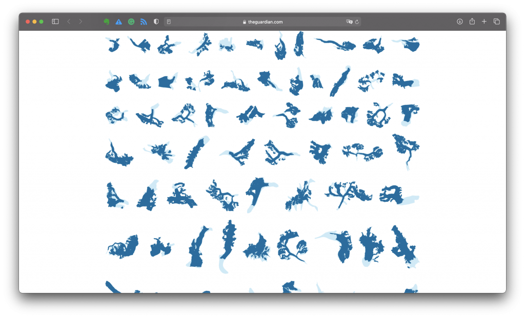
The illustration highlights how the outlines of the 90 largest and most surveyed glaciers shrink over the course of a couple of generations.